Get more premium subscribers by sending teasers of premium emails
My single favorite way to make Buttondown better is a simple two-step process:
- Find desire paths where folks are going through a lot of effort to accomplish a very reasonable task.
- Make that process better.
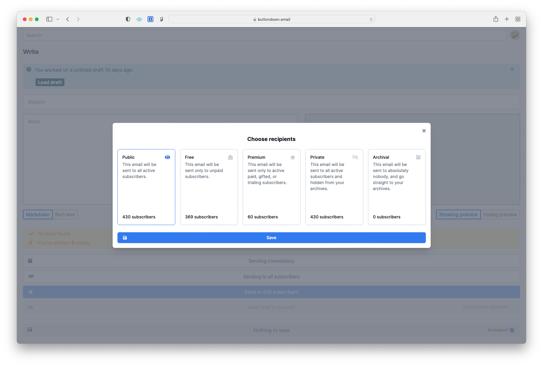
If you’re an author of a premium newsletter, you might be familiar with what is a pretty annoying process every time you write a paid-subscribers-only email: first you write the paid-subscribers-only email filled with lovely writing and send it off to your loyal subscriber base, then you take a truncated version of it and add a little teaser to send to your non-paying subscribers in order to incentivize them to sign up.
I am here to tell you that is no longer a thing! When choosing a cohort of subscribers to send to, you’ll now see an optional toggle to also send a teaser to unpaid folks:
By default, Buttondown sends a “teaser” of the first three paragraphs of your newsletter and then prompts readers to subscribe for the rest, just like online:
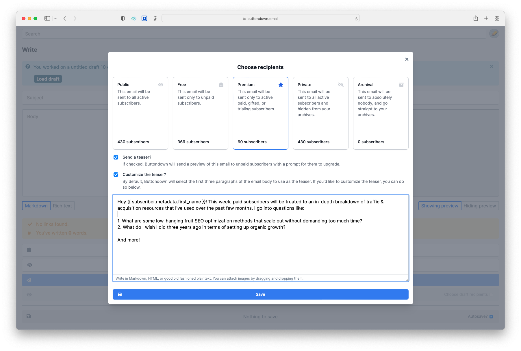
If you’d rather supply your own copy, though, it’s as easy as you’d otherwise expect. And the custom teaser is template-friendly, so you can add all the metadata and variables your heart desires.
I want to invest more over the next few months in making it not just easy for authors to grow and nurture their subscriber base but to make sure the process of converting those subscribers into paying readers is as easy as possible. This is a good first step, but there’s more, like opt-in pageview & archive tracking, so you can analyze which emails are best at both bringing in new subscribers and converting those subscribers and tiered subscription levels.
But beyond all that, I’m just interested in making Buttondown easier. If you find yourself feeling like it’s taking you twenty clicks to do what should take three, please email me and tell me more — I can’t wait to hear from you.
Postscript: some fun technical details
On the technical side of this feature, there were two particularly interesting challenges of note:
- There are a lot of assumptions around email rendering & broadcasting that I had to unwind, forcing me to tweak the core rendering infrastructure for the first time in around two years. (Nothing bad happened! Yay!) At the core of the trickiness was the fact that the number of inputs to “who should I send this email to?” increased; this trickiness was compounded by the fact that the number of inputs to “how should I render this email for this subscriber” also increased.
- You see that second screenshot with the teaser email and how the final paragraph fades into white? That was trickier than it seems (and indeed, trickier than it should be thanks to the vagaries of Gmail!) I tried a number of different masking CSS techniques, all of which got swallowed up by Gmail’s aggressive CSS purging.