Navigation updates
Buttondown’s navigation has… not been ideal. For a long time.
The navigation itself has barely changed since it got set in stone in early 2017; you can see it in action (with slightly different CSS, and no dropdown menu) in a blog post from 2017!
I say it’s not ideal for a handful of reasons:
- The mobile experience is trapped in a state of “trying to be cute” and looking like a tab bar
- There’s a weird bifurcation between the primary navigation of “Write / Subscribers / Archive” and the secondary navigation (to, say, tags or scheduled emails) because I wasn’t smart enough to figure out an extensible navigation.
- Important links (say, to documentation, or pricing details) are hidden in the Footer and completely inaccessible once you’ve logged in.
I’ve been meaning to take another stab at navigation for a while now: every time I add a new settings subpage or nested modal the situation grows a little more dire, and it is finally time to tear off the bandaid.
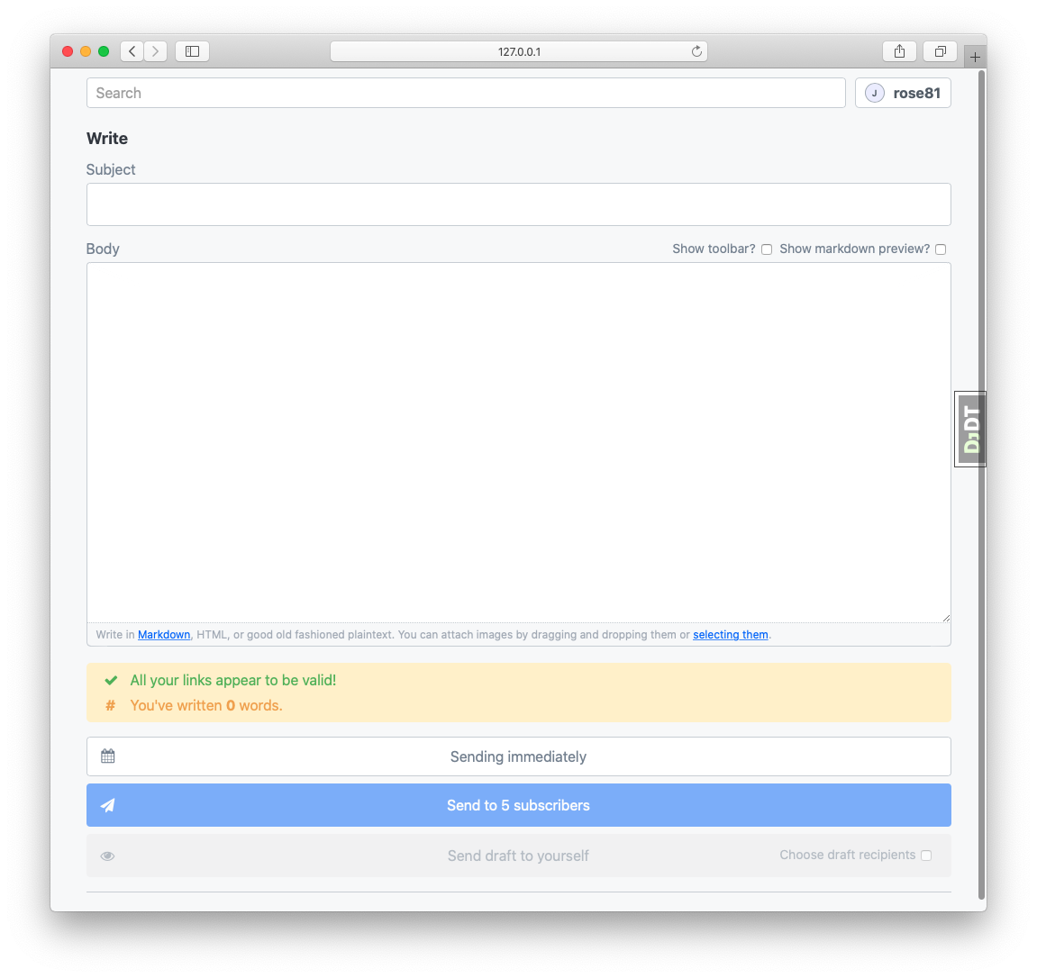
Behold!

…Oh wow. That’s rather spare, isn’t it?
Let’s dive into these two new affordances.
Omni-search

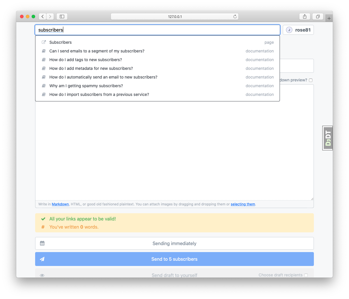
As you might guess from the title of this heading, “omni-search” is a universal search bar. You can search for all sorts of things:
- Subscribers
- Archives
- Internal and external pages
- Documentation
The search bar is fast, it is accessible, and it is always a keystroke away (just hit /).
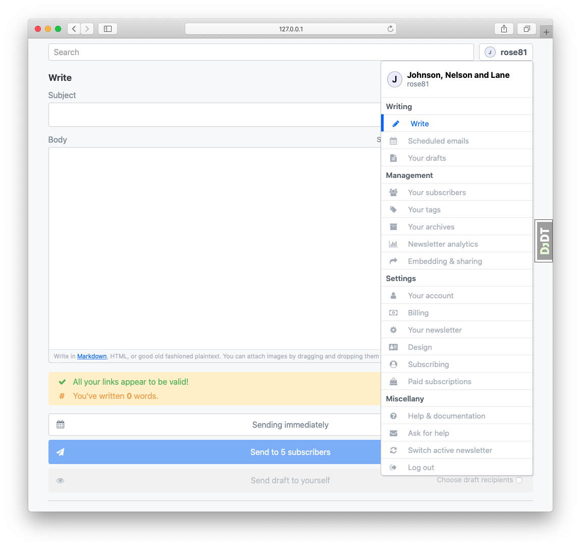
The big ol’ dropdown

This dropdown should look pretty similar to the old one, except with, well, more of it. Gone are the weird sub-navigation hierarchies: everything is just here.
Change is hard, I know.
I’m fairly sensitive to the fact that changing workflows and interfaces is onerous and painful. Adjustment takes time! This is a pretty opinionated interface, but it feels scalable in a way that the previous interface certainly was not. I apologize for whatever short-term friction this causes you, and please send me feedback if you’d like: I’m always open to methods for making Buttondown a better experience.